Blue-light glasses have often looked like a category before they looked like eyewear.
The visual language is familiar: overtly technical styling, conspicuous branding, shapes borrowed from gaming equipment, and a frame designed mainly to advertise what the lens is supposed to do. The result may communicate function, but it can feel disconnected from the rest of a wardrobe.
That separation is unnecessary. A lens feature and a frame design answer different questions. One concerns the lens. The other concerns the object placed on the face.
What makes a pair immediately look like “blue-light glasses”?
It usually happens when every design choice is asked to signal technology. The frame becomes more aggressive, the color more artificial, and the lens treatment more visually dominant. Instead of fitting into everyday clothing, the glasses begin to resemble equipment intended for one setting.
There is nothing inherently wrong with a technical aesthetic. It can make sense for gaming, sport, or a deliberately futuristic look. The problem appears when that aesthetic is treated as the only possible expression of the category.
Most people move between settings. The same person can work at a screen, enter a meeting, travel across the city, and have dinner without wanting to change visual identities. Eyewear should be able to move with them.
Does a lens feature need to determine the frame?
No. The presence of a blue-light filtering lens does not require one particular silhouette, color, or style language. Those are design decisions.
This distinction matters because a frame is seen before its specification is read. Proportion, bridge placement, lens shape, color, and the relationship to the face form the first impression. Technical information can then be explained precisely, without forcing the frame to perform that explanation visually.
When design and specification are separated, each can be judged more clearly. The frame can be evaluated as eyewear. The lens can be evaluated on its stated characteristics. Neither has to compensate for the other.
What does “real eyewear” mean?
It does not mean pretending the lens feature is absent. It means making a pair someone would still choose if the technical paragraph were temporarily removed.
Real eyewear has a coherent silhouette. Its color makes sense with clothing. It can be worn repeatedly without appearing tied to one device, activity, or moment. It has enough character to feel chosen and enough restraint to remain useful.
This is how established eyewear houses have traditionally approached the object. They lead with shape, material, place, or point of view. Function remains important, but it does not replace design.
What is fashion showing us about optical frames?
Optical eyewear is currently becoming more visible, not less. Vogue’s fall 2025 coverage documented spectacles across major fashion runways, where they were treated as deliberate accessories. In 2026, GQ’s Paris street-style report showed how round tortoise, rimless, metal, and more expressive frames could each change the character of familiar clothing.
The important signal is not one shape. It is permission. Glasses no longer need to disappear in order to look sophisticated.
The MIDO 2026 trend report describes eyewear as a space for identity, with classic forms continually reinterpreted through proportion, color, transparency, and detail. That is a more useful direction for blue-light eyewear than inventing a separate uniform for people who use screens.
Can a visible lens tint still look considered?
Yes. A tint is a color decision as well as a technical characteristic. It changes the relationship between the frame, the eyes, and the surrounding clothes.
A visible tint can look archival, cinematic, technical, or deliberately editorial depending on the frame and styling around it. It becomes awkward only when treated as something to hide while the rest of the design draws attention to it.
The more visible the lens, the calmer the surrounding decisions can become. A controlled silhouette and a coherent frame color give the tint room to exist without turning the entire object into a novelty.
How does ATÉN approach the design question?
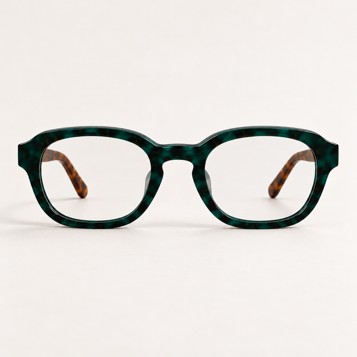
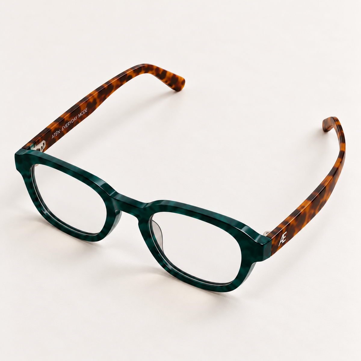
ATÉN begins with one silhouette and gives it three distinct color identities.
Matte Black is defined and architectural. Forest/Tortoise introduces pattern and an uncommon natural tone. Crystal Clear keeps the shape visible while allowing more of the wearer and wardrobe to come through.
The frame does not need to shout about the lens. Its job is to look deliberate on the face and coherent with the rest of what someone wears. Lens information should be stated separately, in clear language, with the same discipline given to any other product specification.
How can you tell whether a pair belongs in your wardrobe?
Ask five questions. Would you wear the frame away from a desk? Does it work with your most repeated jacket? Does the color add something useful? Does the silhouette look intentional from the front and side? Would you still want to wear it after the category’s current attention fades?
If the answers are yes, the glasses are no longer a piece of screen equipment waiting in a drawer. They are eyewear.
Blue-light glasses can look like real glasses because there was never a design reason for them not to. The category only needed to stop treating style as an optional layer added after the function was decided.
Explore ATÉN
The ATÉN collection gives one silhouette three identities: Matte Black, Forest/Tortoise and Crystal Clear. Compare Everyday Mode’s subtle warm tint, Focus Mode’s pronounced amber tint and After Hours’ deep red tint in the ATÉN lens guide.

Leave a comment
All comments are moderated before being published.
This site is protected by hCaptcha and the hCaptcha Privacy Policy and Terms of Service apply.